Lipton Pop Art

Popping out: a rotating art gallery of cans.

Flavors that are full of personality deserve inspired packaging to match. Through four series of mini cans, we gave Lipton Ice Teas in Russia an invigorating, limited-edition new look with original pop art.

Brand

Lipton

Region

Europe

THE IDEA

A bold, bright, shelf-disrupting new look.

We wanted to attract shopper’s attention to Lipton mini cans in the cluttered beverage category, so we set to work refreshing Lipton cans with unexpected, pop art-inspired designs, taking a cue from the tea’s refreshingly crisp taste. Our artwork had to cleanly distinguish each individual flavor—lemon, peach and green tea.

THE DESIGN

Accessible, collectable art, on exhibit in stores.

The pop art movement played into the imaginative spirit of Lipton perfectly—and with such a wide breadth of pop art styles to explore, we unveiled four series of cans with eclectic and distinctive looks. We wove in the ingredients across each one—whether placed in a single frame of comic-strip inspired designs or featured boldly, dimensionally and on repeat across each can.

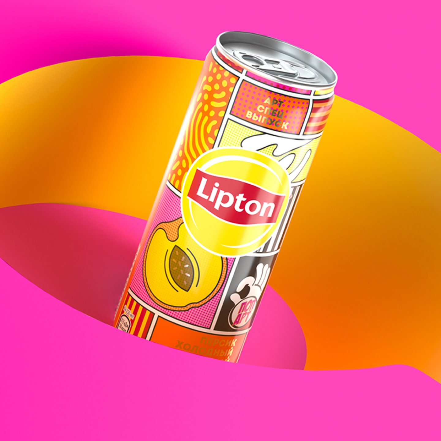
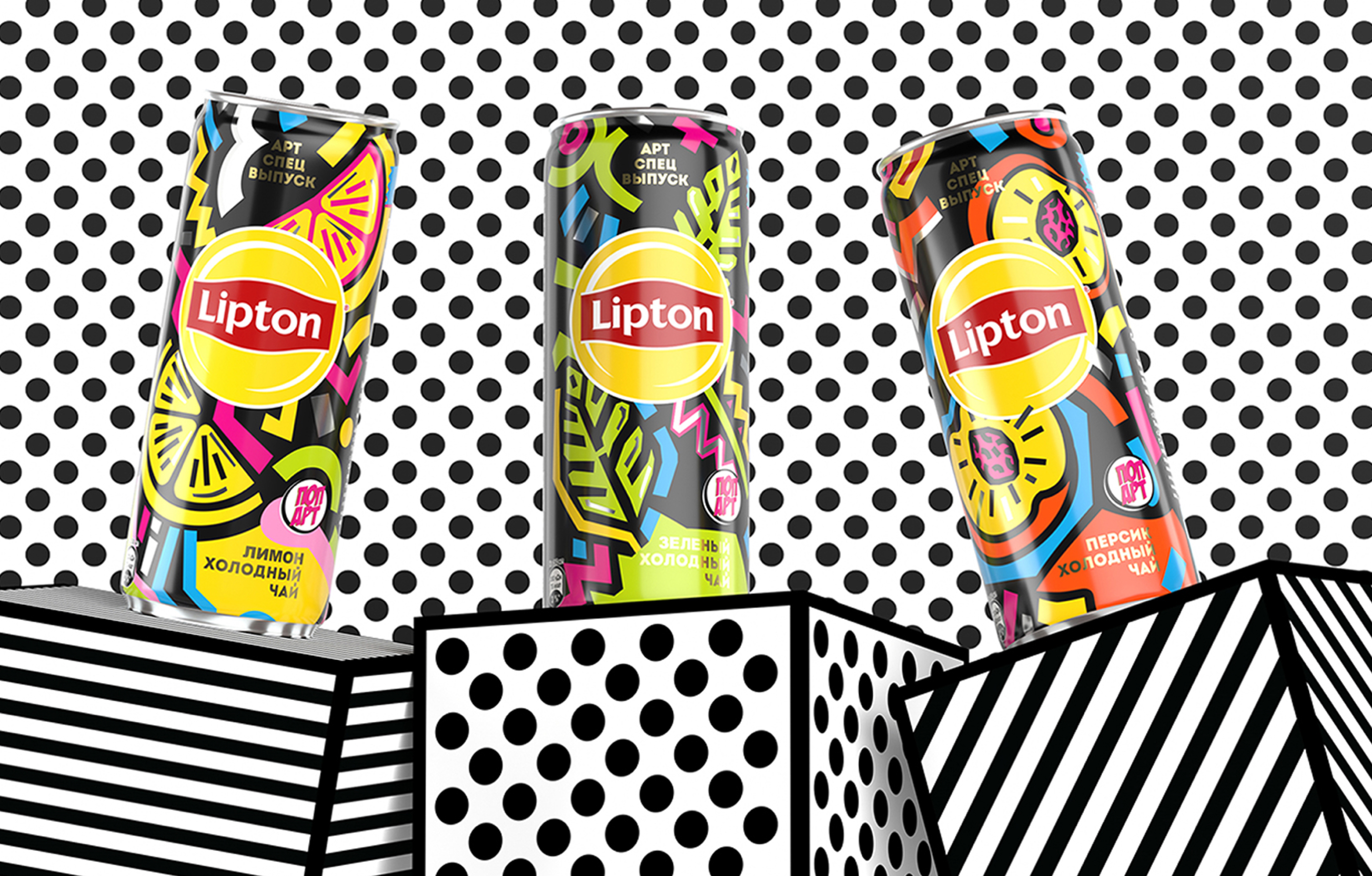
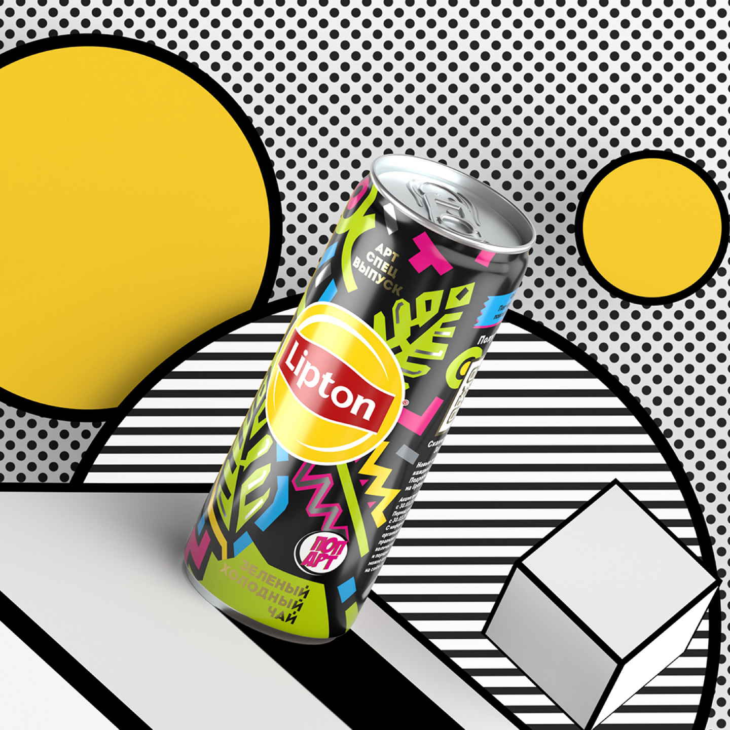
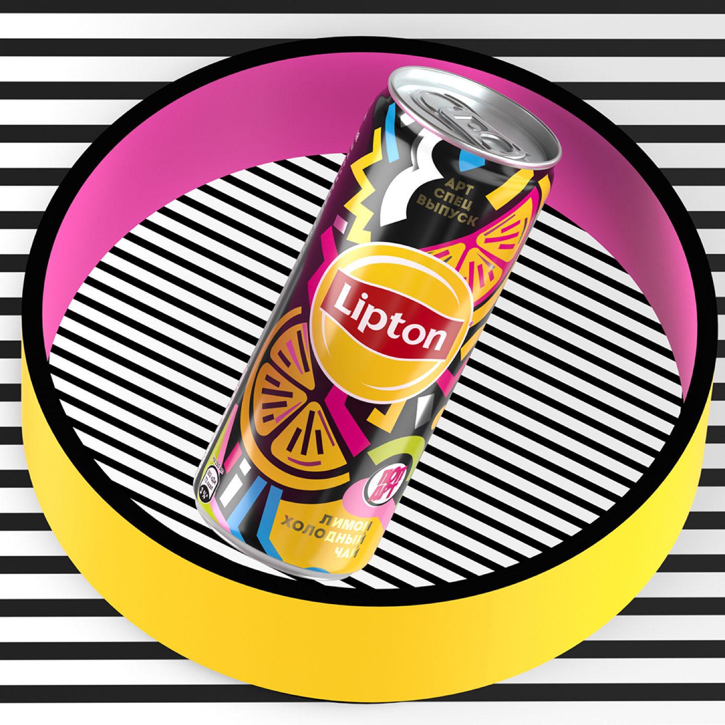
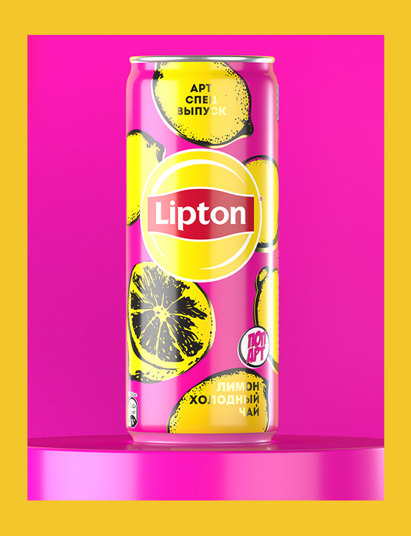
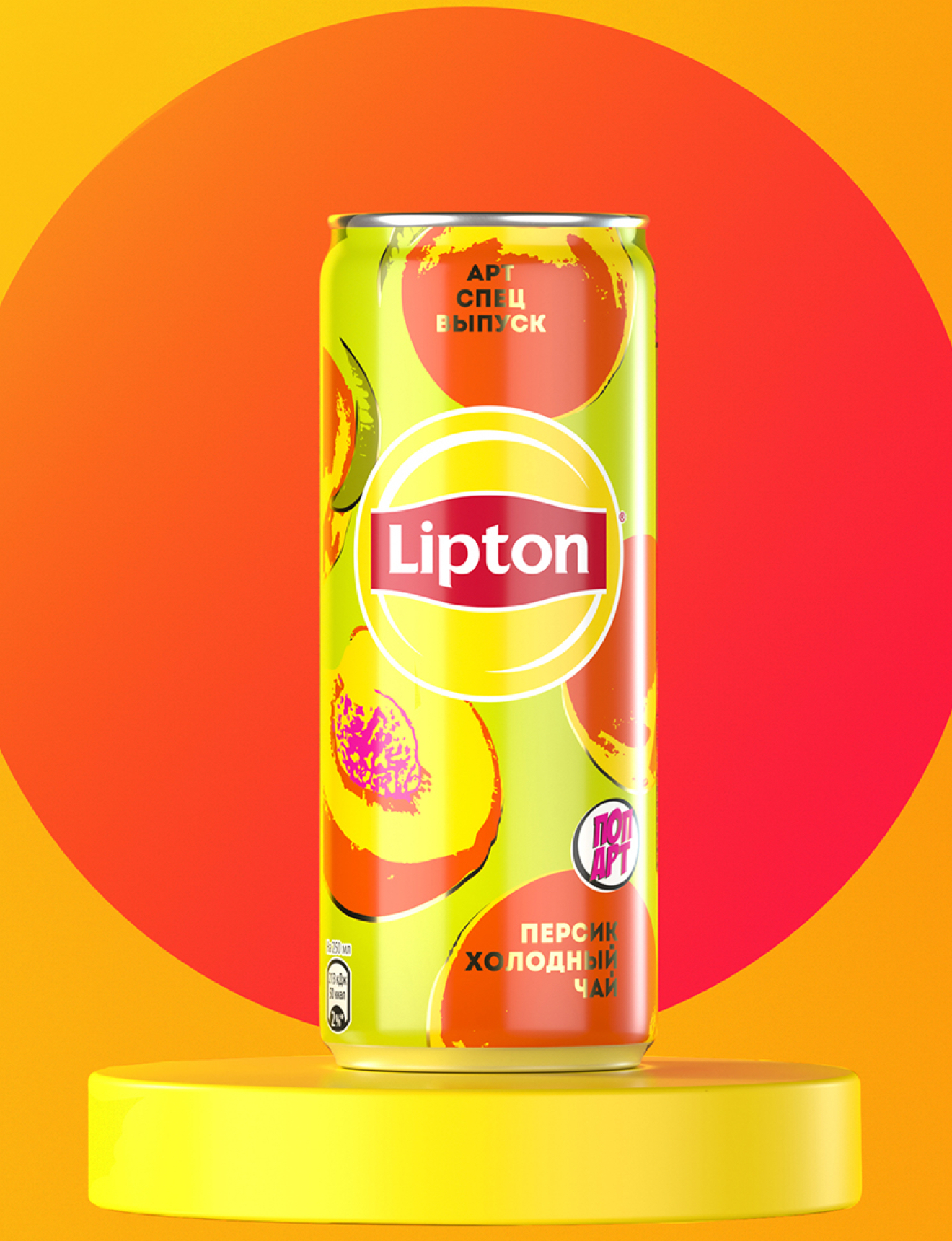
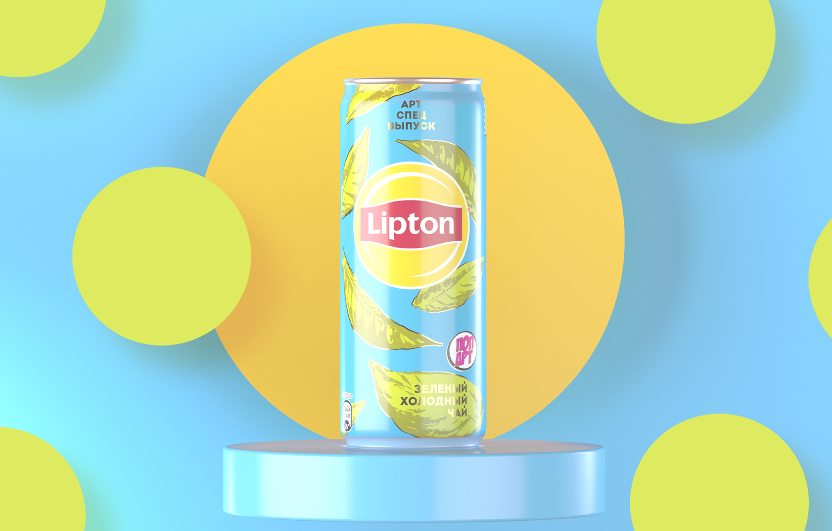
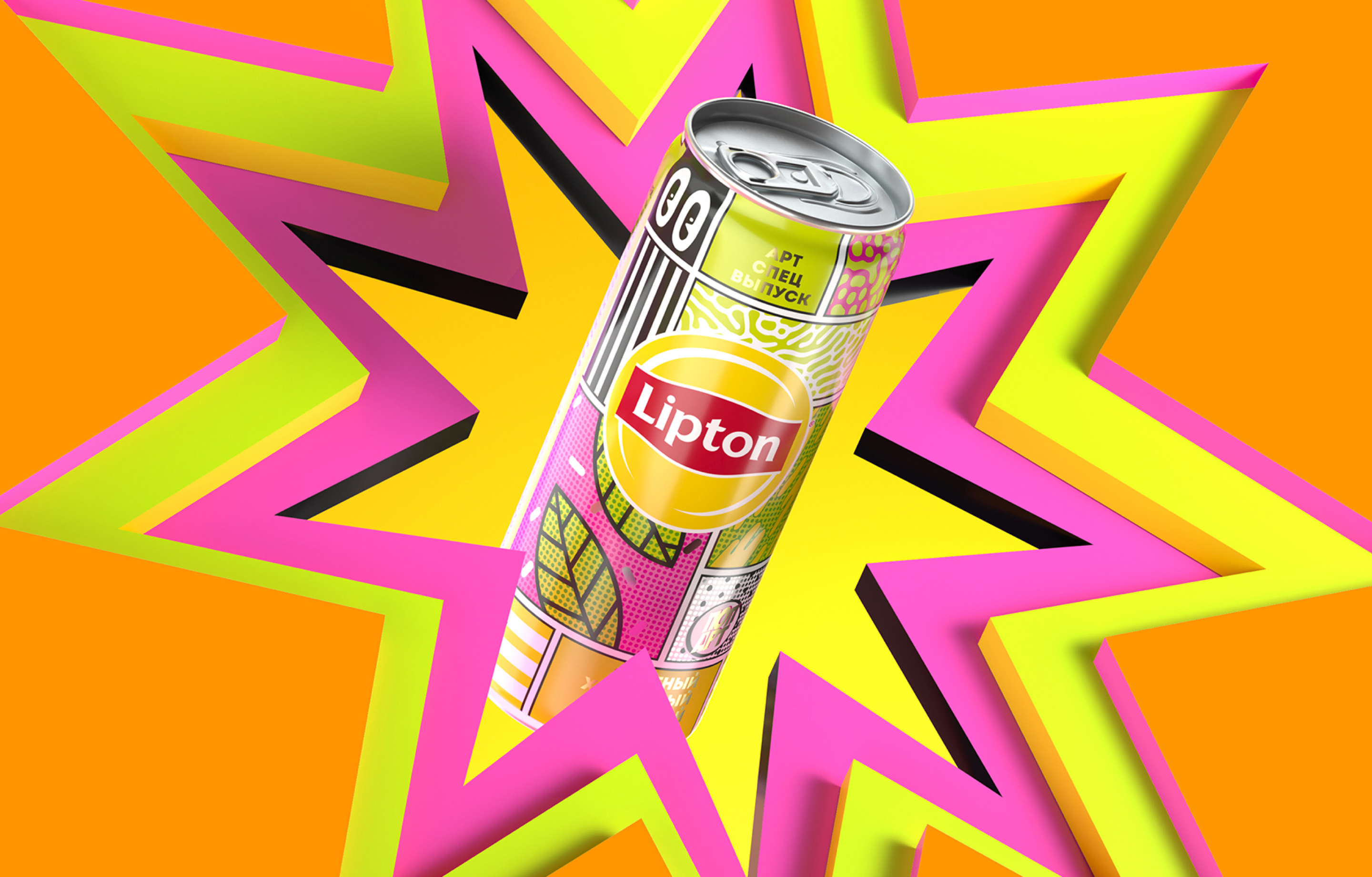
They were artful, yet accessible—and to make them even more friendly, we made our limited-edition cans in mini 250mL sizes. We like to think the smaller sizes welcomed our customers to collect these punchy minis—or to try a new flavor. It was a true transformation of our shelf space into a (friendly) art gallery.

Awards + Press 6

  • 2021 A' Design Award & Competition
  • 2021 Annual Communicator Awards
  • 2021 Hermes Awards

  • 2020 Creativity International Design Award, Silver
  • 2020 MarCom Awards, Platinum
  • 2020 NYDA Driven x Design Awards, Silver