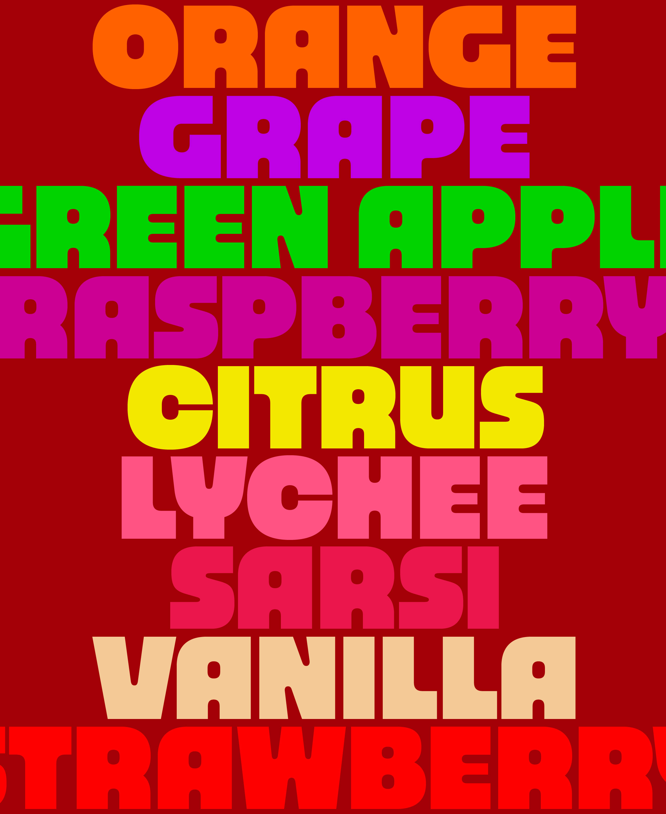
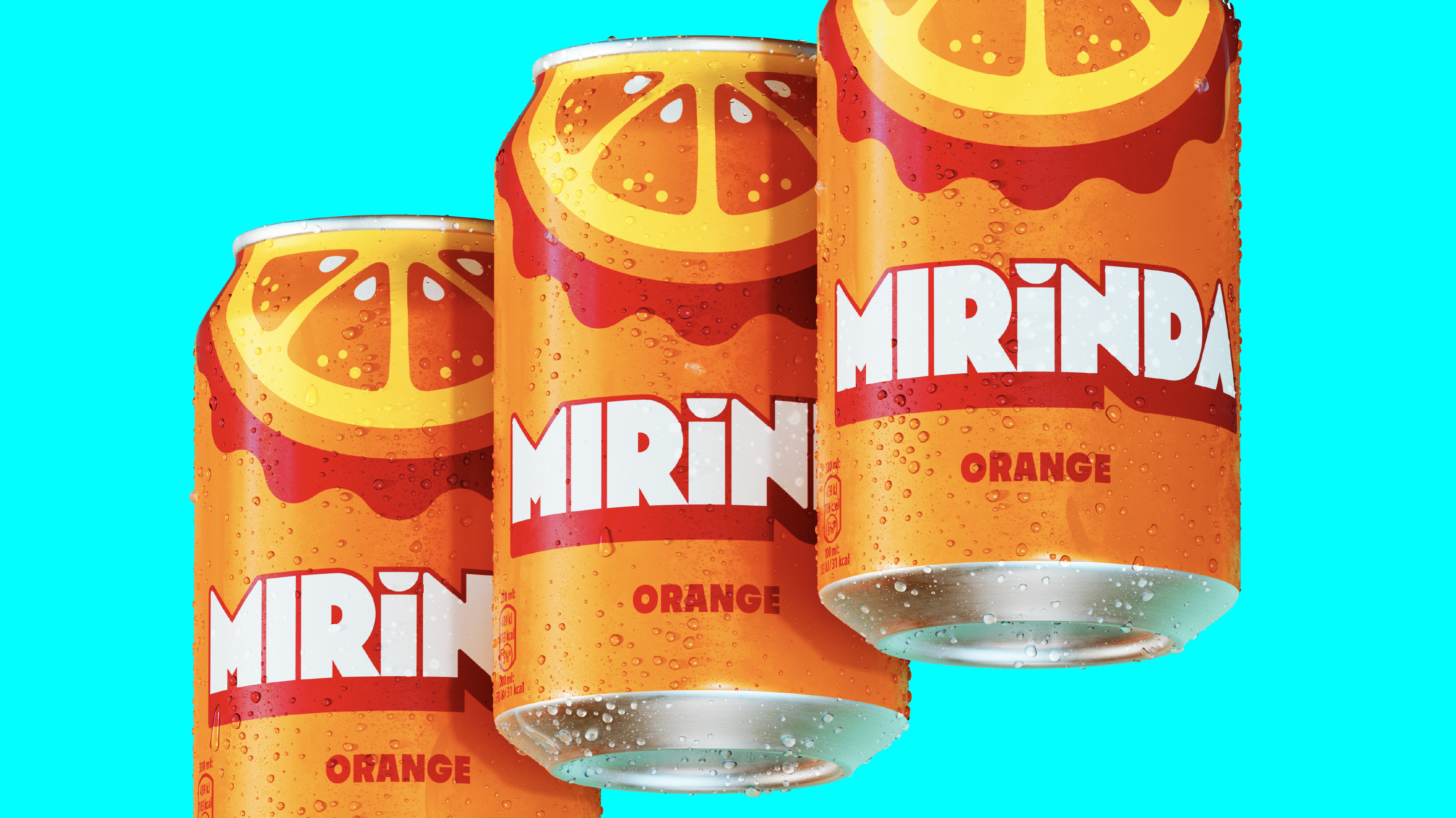
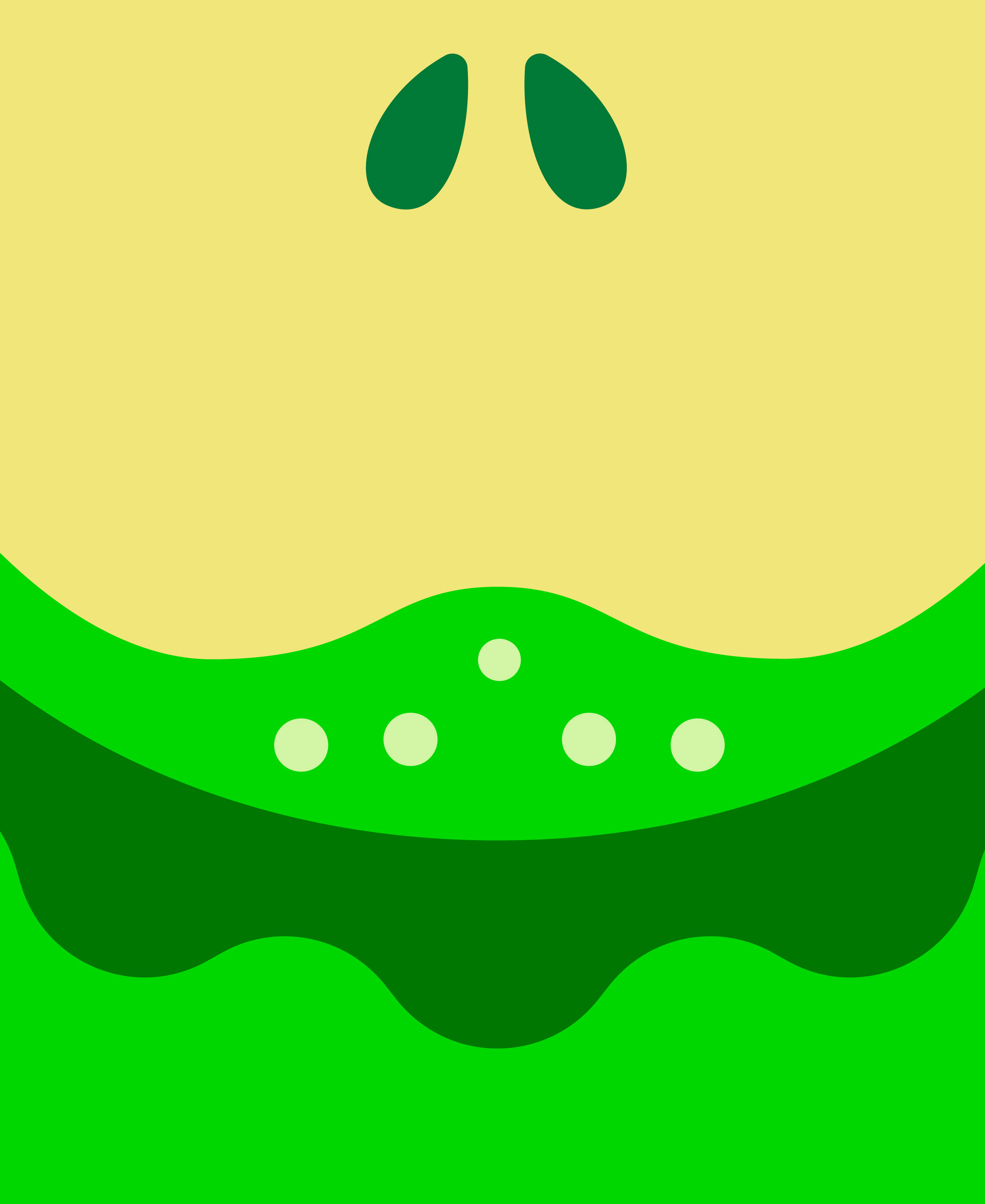
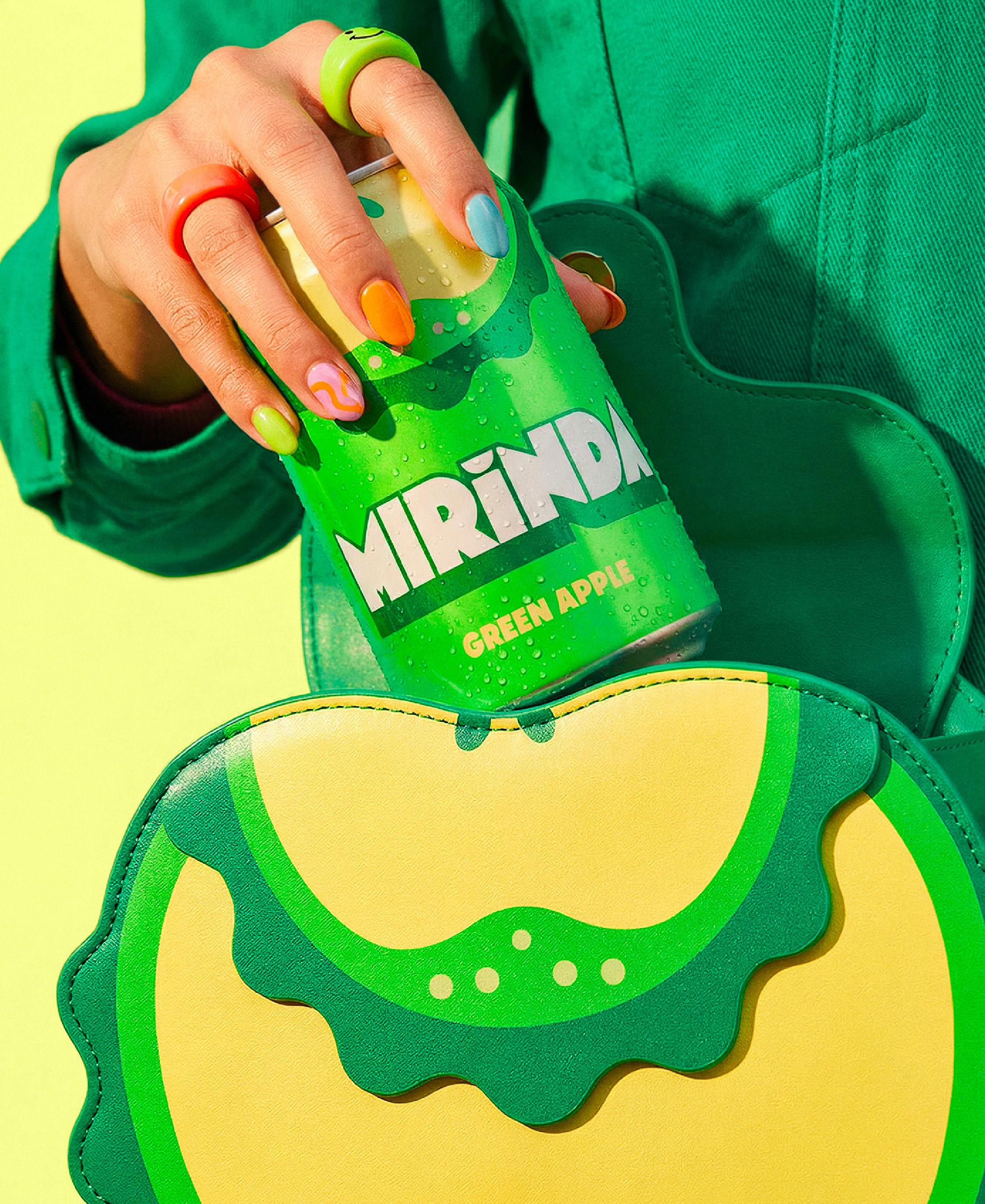
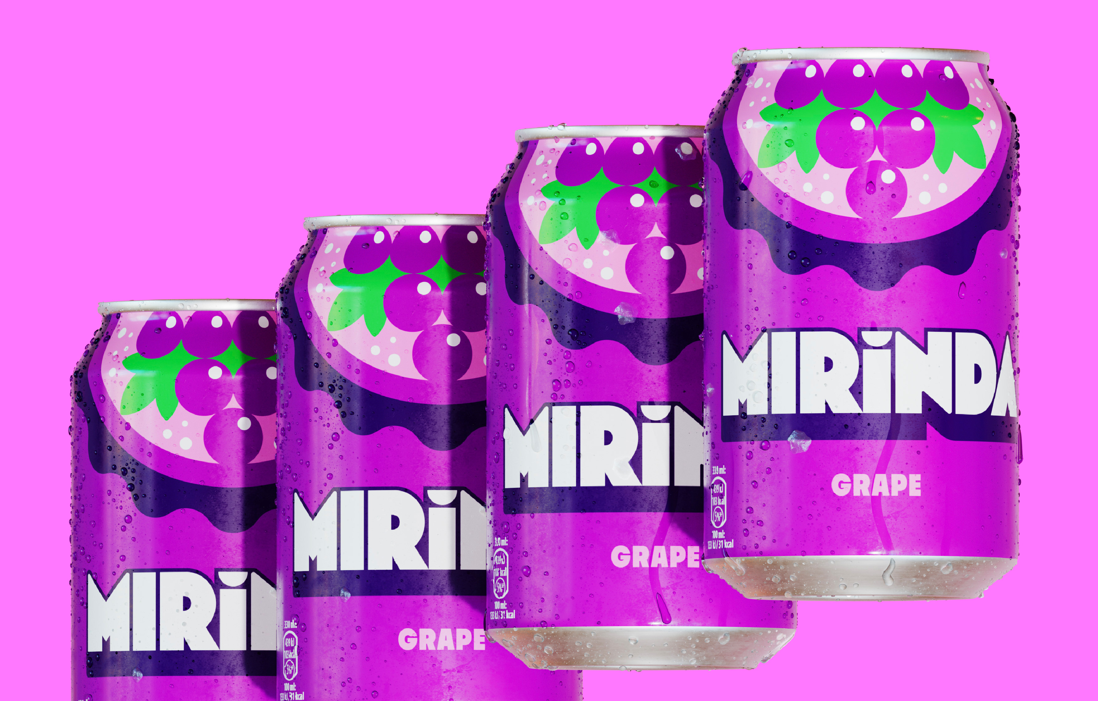
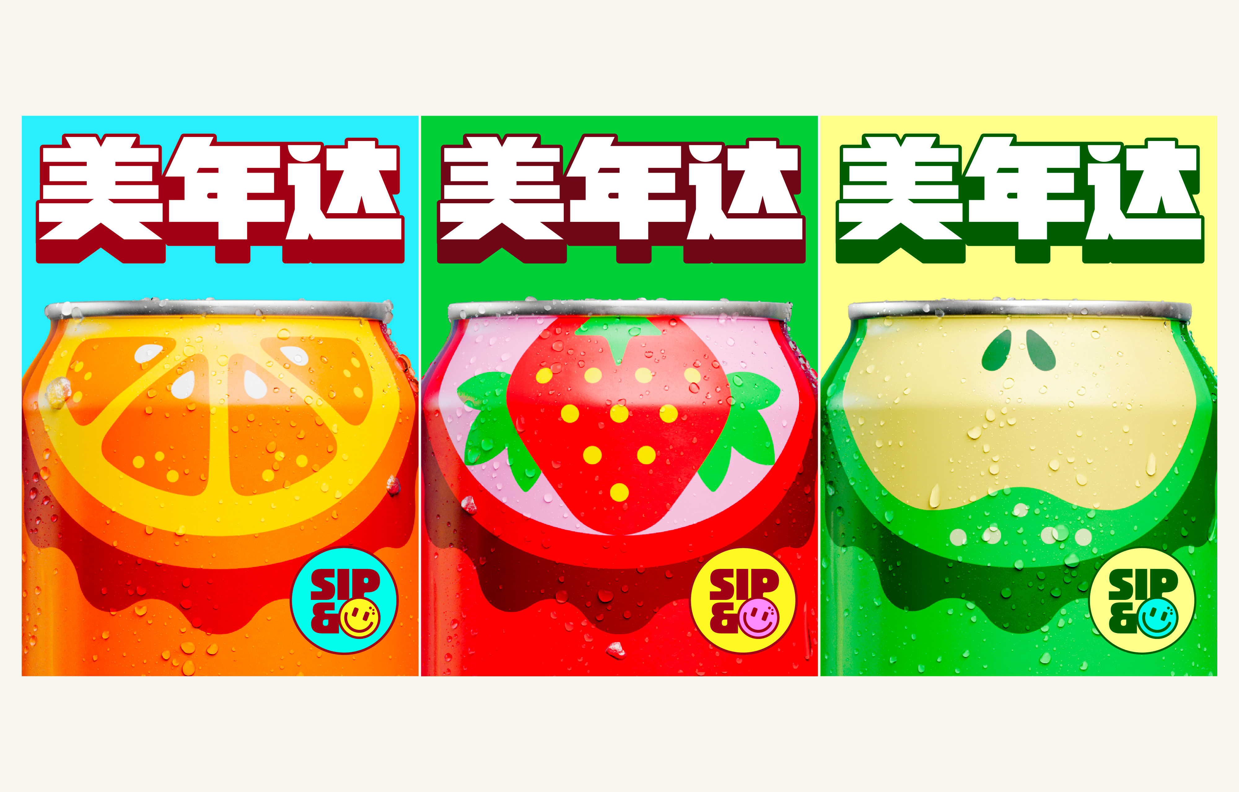
Mirinda Global Restage

Making Flavour Impossible to Ignore

Mirinda has always been about flavour and unapologetic fun. But in a crowded soda category, the brand lost clarity at shelf, relying too much on colour and logo while flavour became less immediate.

Brand

Mirinda

Region

Europe

The Shift

By looking to its past to shape its
future, we went back to 1959 and
revisited visual codes from the 60s,
70s, 80s and 90s, reconnecting with a
spirit that has always been playful,
expressive, and full of life.
We moved from a brand-led identity to
a system of expression, where flavour
becomes the most distinctive and
immediate element. Flavour should be
seen, not just read. Mirinda is a flavour that smiles.

Design Approach

Flavours are translated into bold,
expressive shapes. Oversized fruit,
built from simple semi-circular forms,
creates a distinctive and ownable
visual structure.
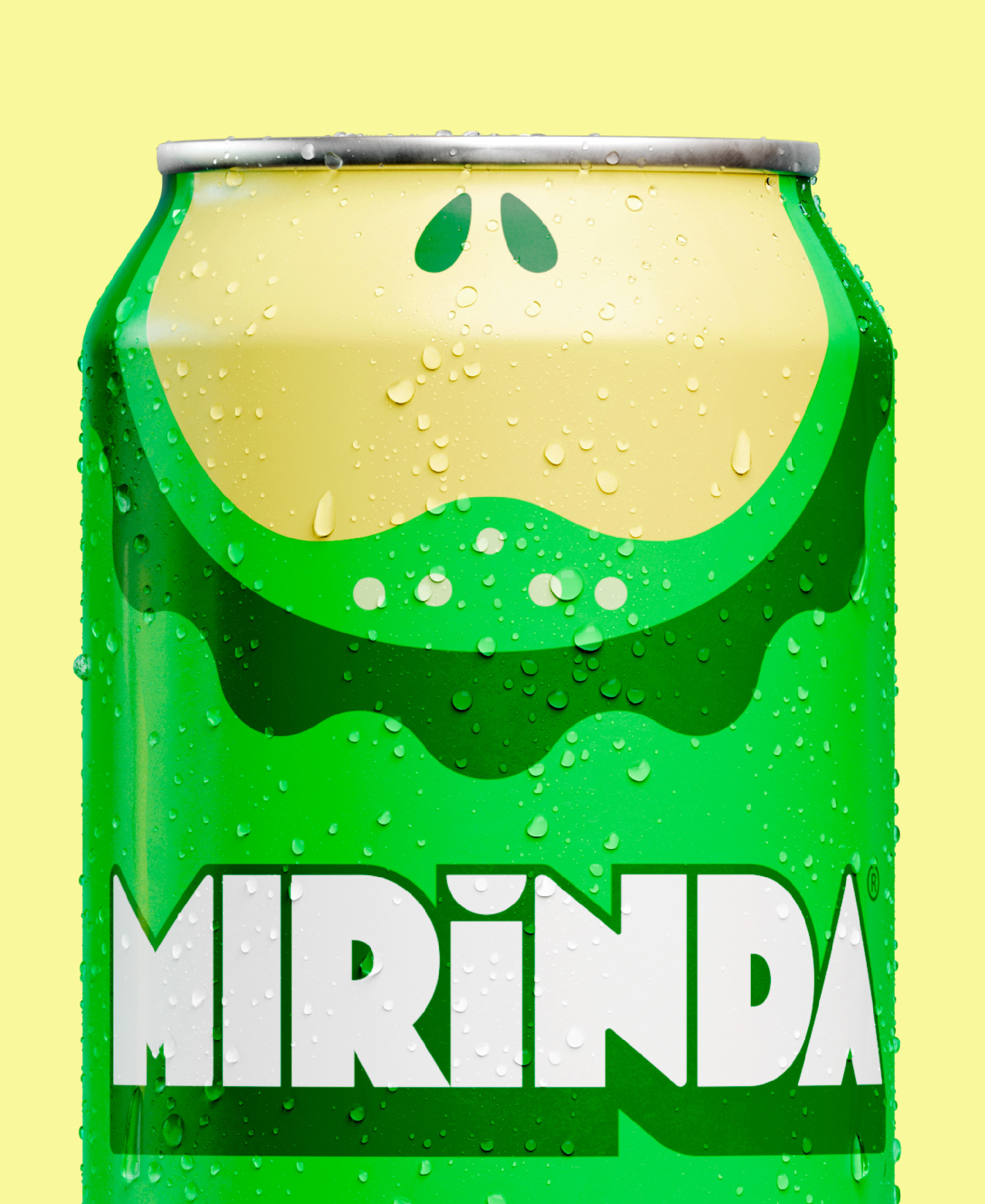
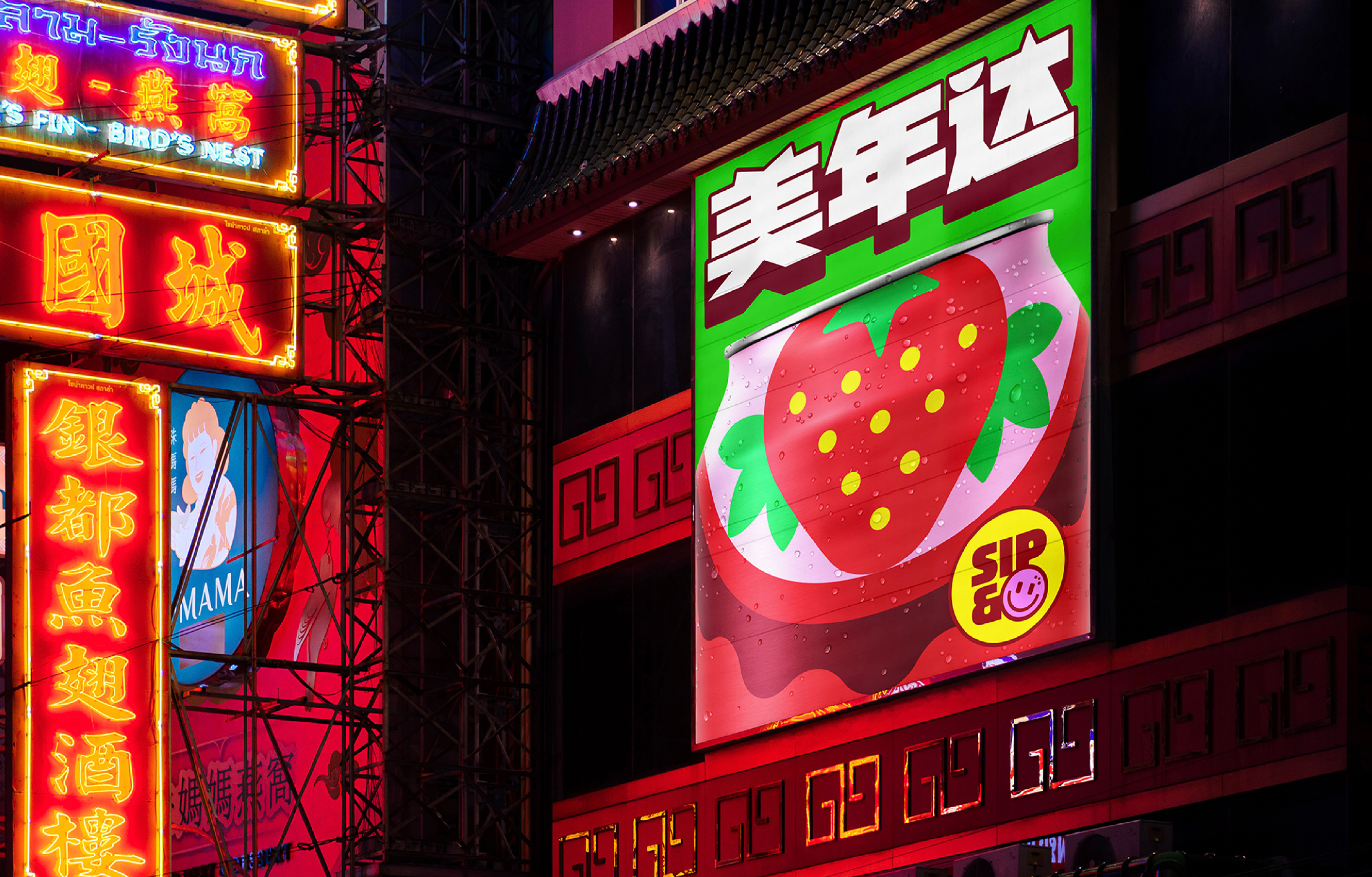
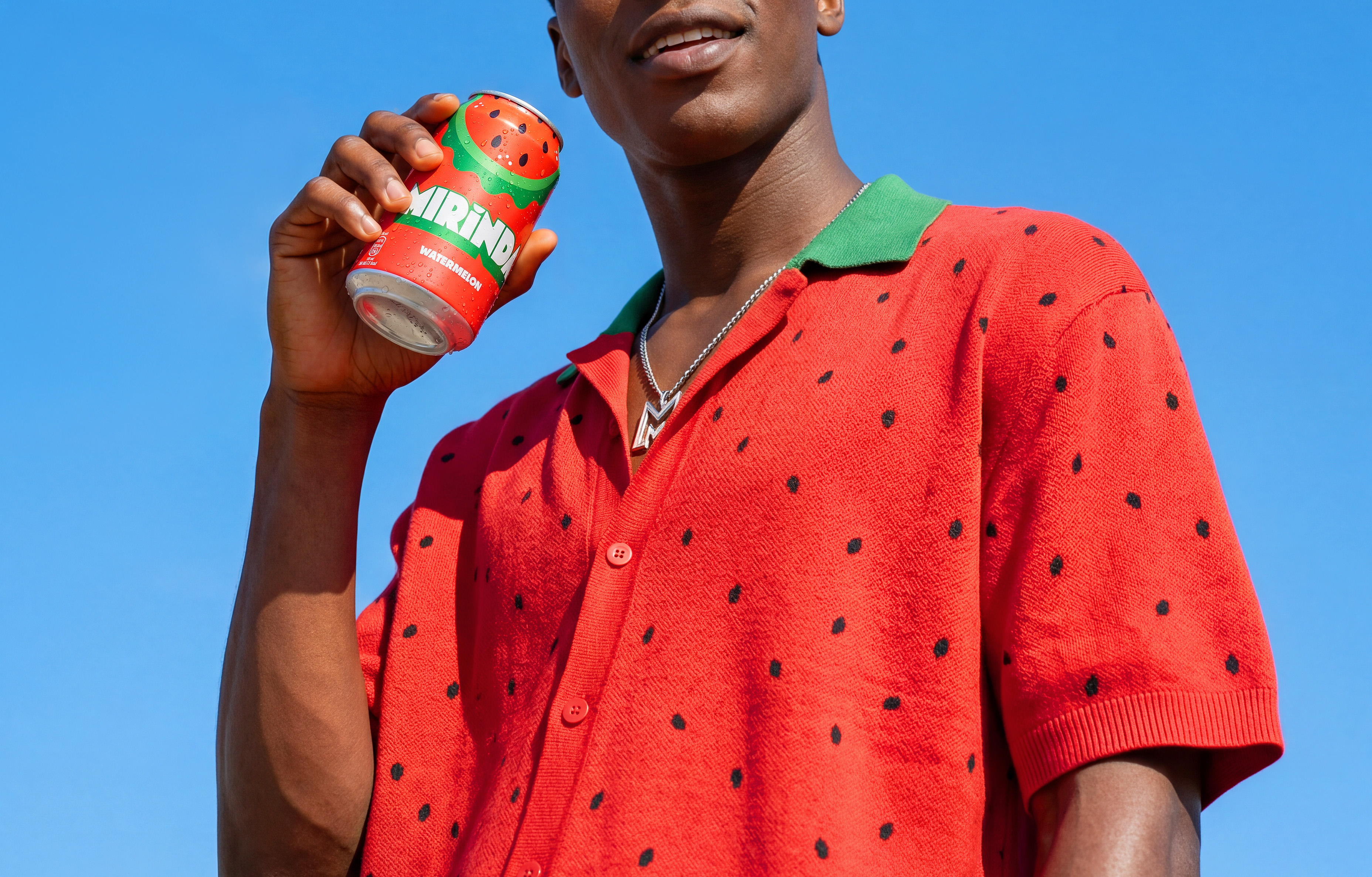
The system feels playful and tactile,
designed to spark curiosity and invite
interaction, with the kind of immediate
appeal of an object you want to pick
up. It delivers strong, clear flavour
cues, with a subtle sense of nostalgia,
reinterpreted for today.

Mirinda finds its voice.

Mirinda Burst is not just a typeface, it’s
how the brand is recognised. Original,
distinctive, and full of character, it
creates a strong visual connection,
something you can spot instantly.
Working in harmony with the fruit
shapes, it brings consistency to the
system and reinforces Mirinda’s
identity across every touchpoint.

The Outcome

The new identity works faster,
and invites interaction. It brings
flavour to the centre, making
Mirinda more intuitive,
distinctive, and competitive
across markets.
A flavour that smiles. So Sip a
Mirinda, And Smile Pls.