MEET THE NEW MOUNTAIN DEW

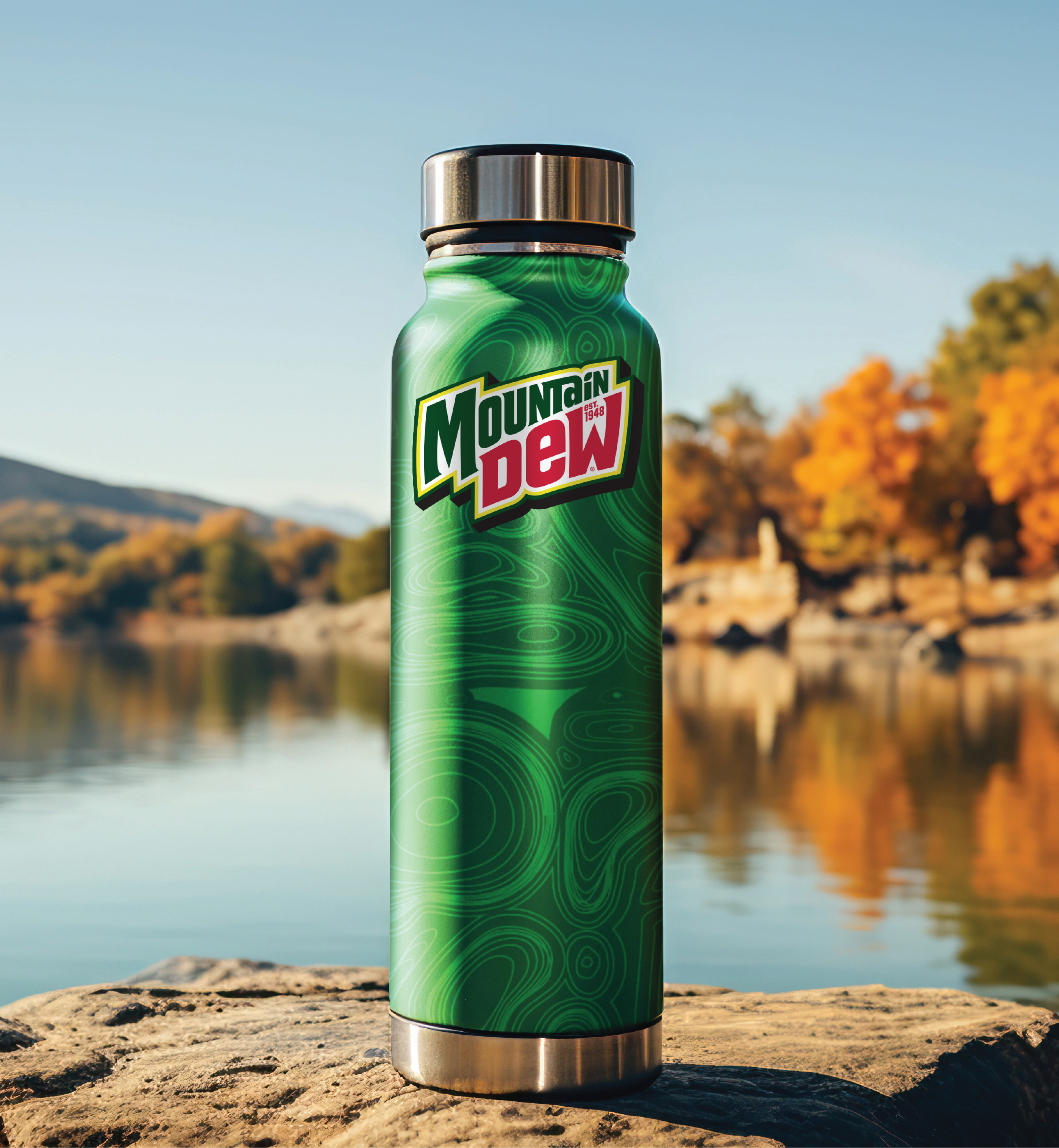
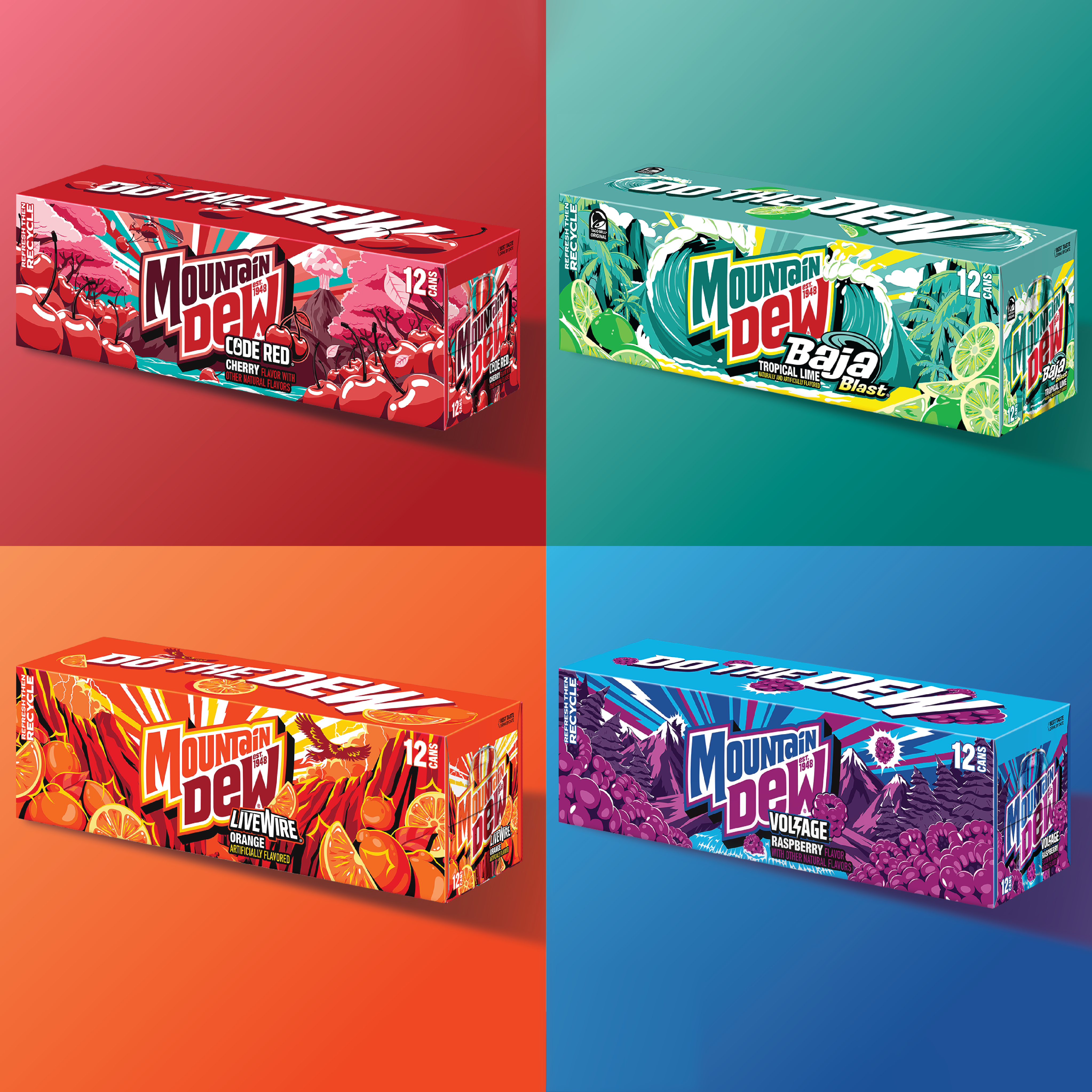
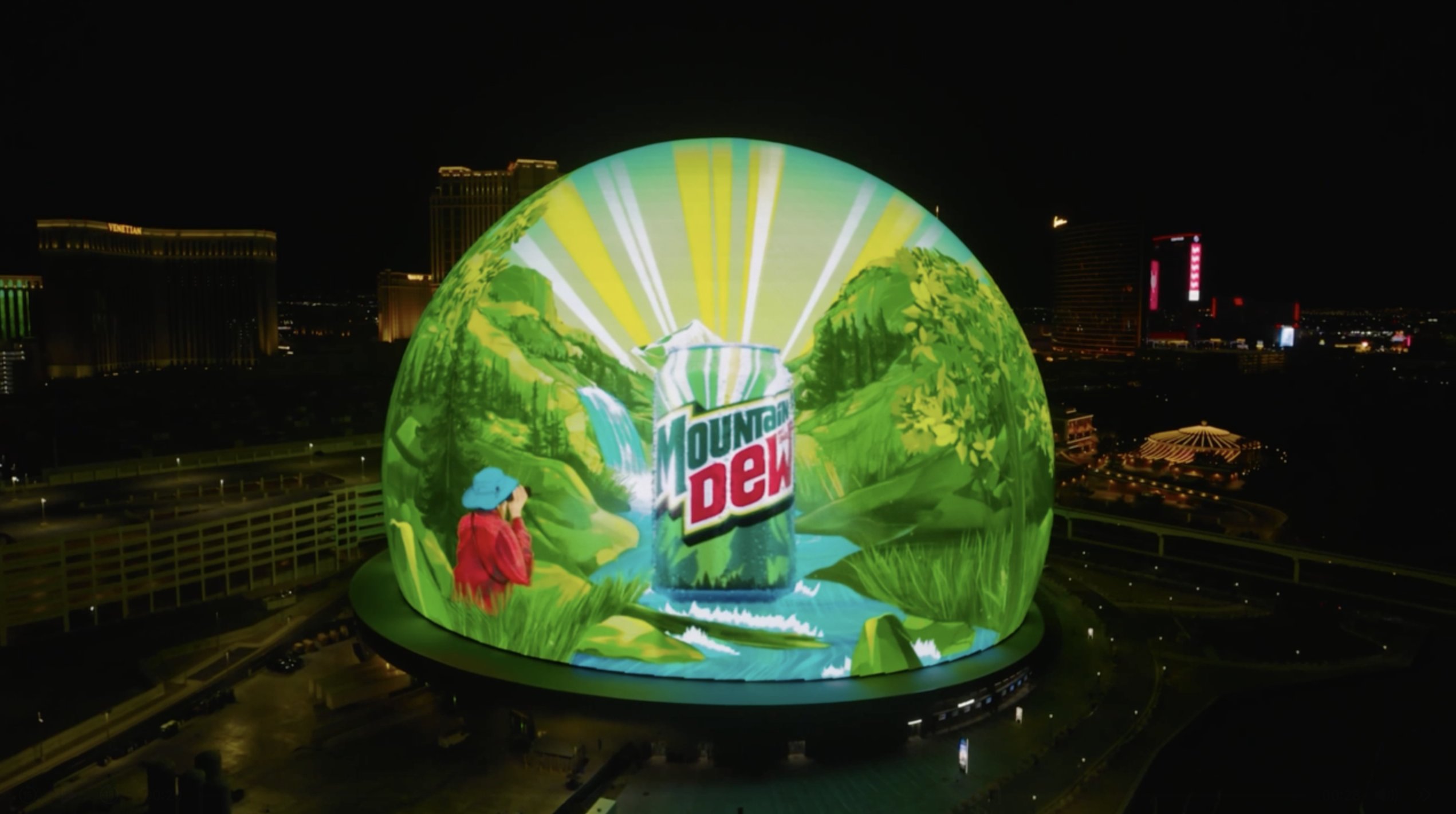
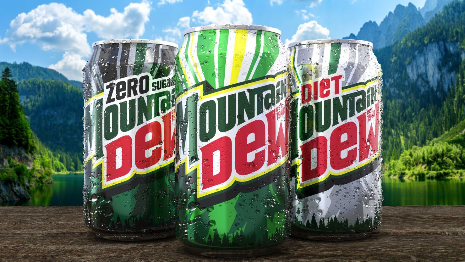
New look, same bold, refreshing flavor.

After 14 years as MTN DEW, the brand is turning over a new leaf and going back to its roots as Mountain Dew. We created a new visual identity that celebrates our heritage while boldly looking ahead, with inspired landscapes, nods to our fruity flavor portfolio, softer angles, and refreshed colorways. Our team brought all the flavor, refreshment, and outdoorsy optimism of Mountain Dew to this approachable and adventurous new look.

Brand

MTN DEW

Region

North America

Nostalgia was our North Star throughout this redesign.

The new logo shifts away from the sharp, extreme energy of the previous brand mark. We reintroduced the full Mountain Dew name, softened the wordmark’s angles, and added a citrus leaf icon over the “i” to highlight flavor. We included the brand’s founding year to reinforce heritage and build trust. Inspired by vintage WPA National Parks posters, our packaging artwork and other supporting elements embrace an outdoorsy feel with stylized landscapes and sunburst patterns that evoke refreshment and exploration. A new color system brings in sunlit yellows, energetic blues, and richer greens, while each flavor is anchored in a “V” formation, giving prominence to taste in every scene.

This rebrand marks one of the most significant shifts in Mountain Dew’s history.

The new design effectively repositions Mountain Dew as more inviting, flavorful, and in tune with today’s culture, while still honoring what Dewnation loves most. With retro-modern design and welcoming outdoor aesthetics, Mountain Dew is ready to appeal to a whole new generation.