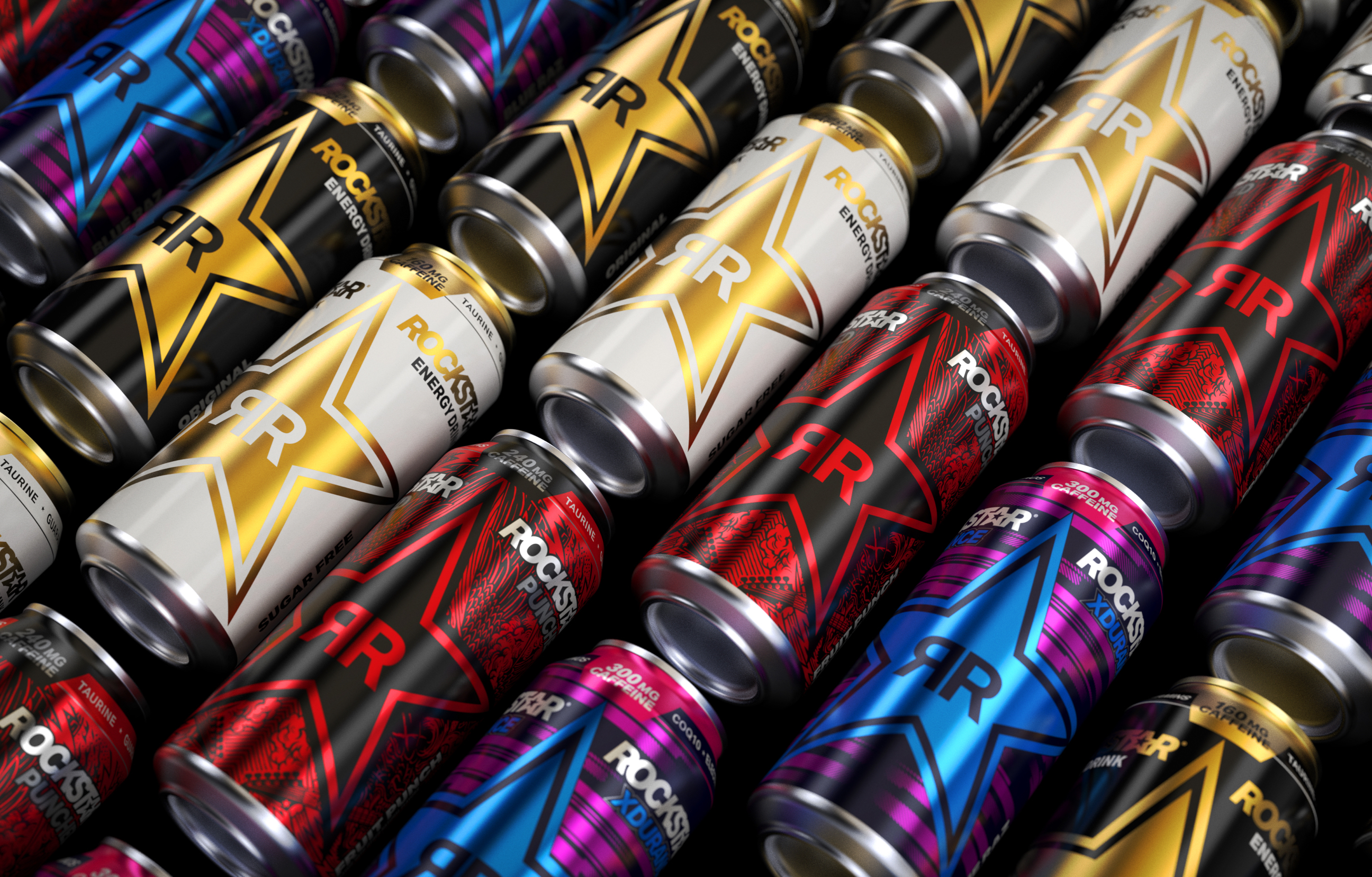
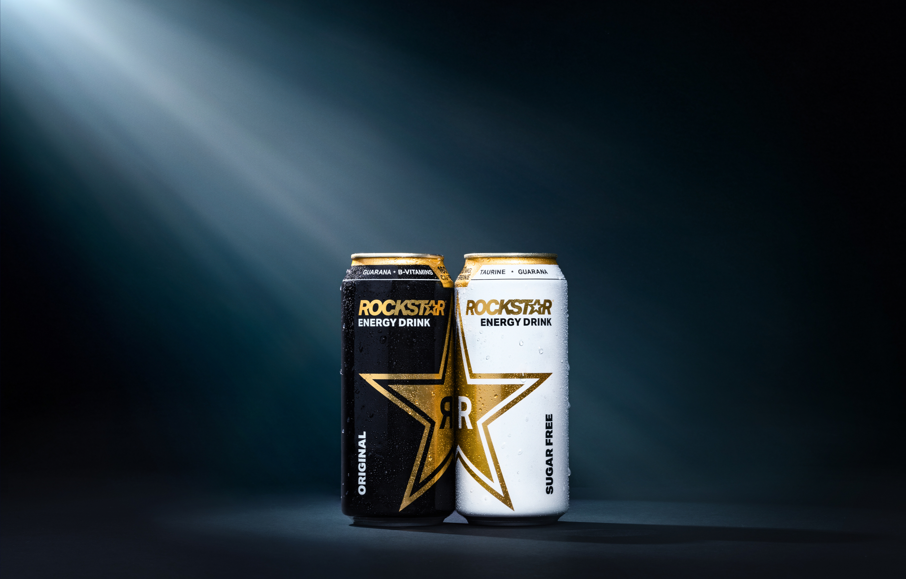

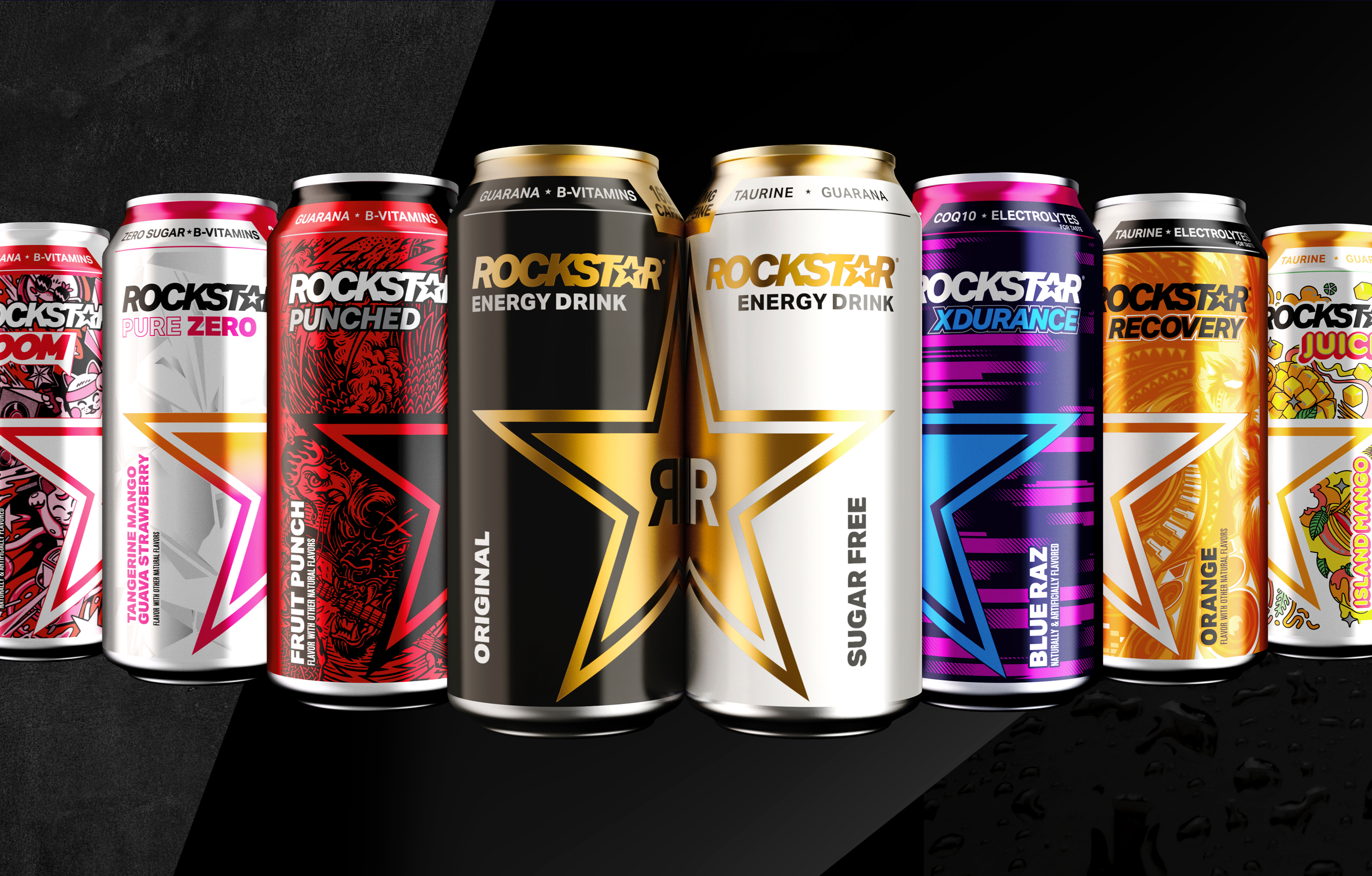
To make Rockstar’s key information stand out, we moved it to the top of the pack and added an iconographic caffeine level system to help customers shop based on their unique energy needs. For the finishing touch, we reduced SKU size so that Rockstar’s showstopping logo could be front and center.
Inspiring the Next Generation of Hustle
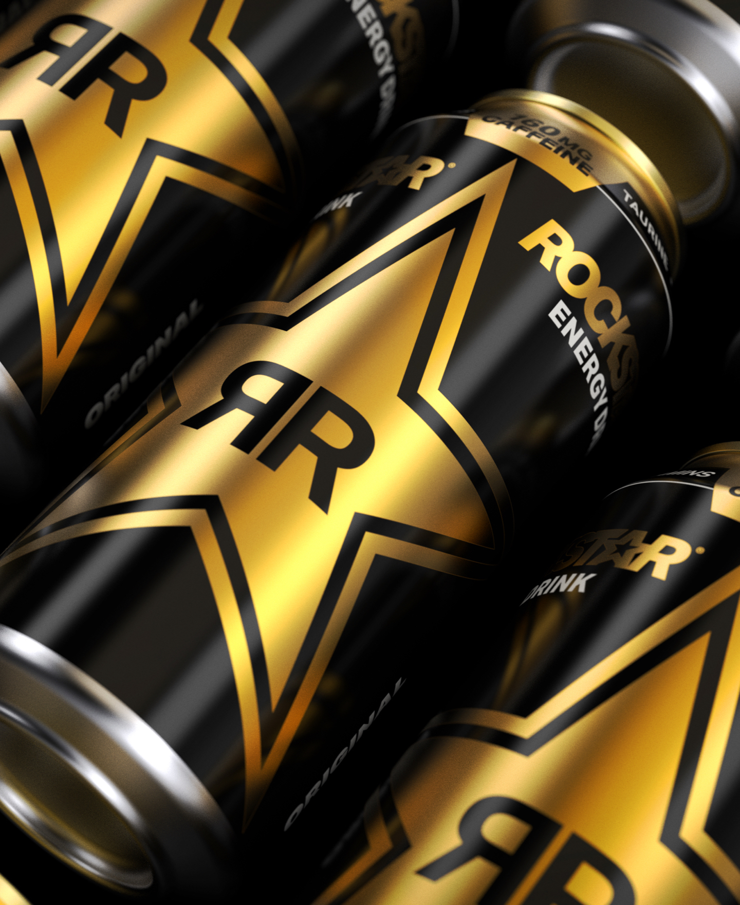
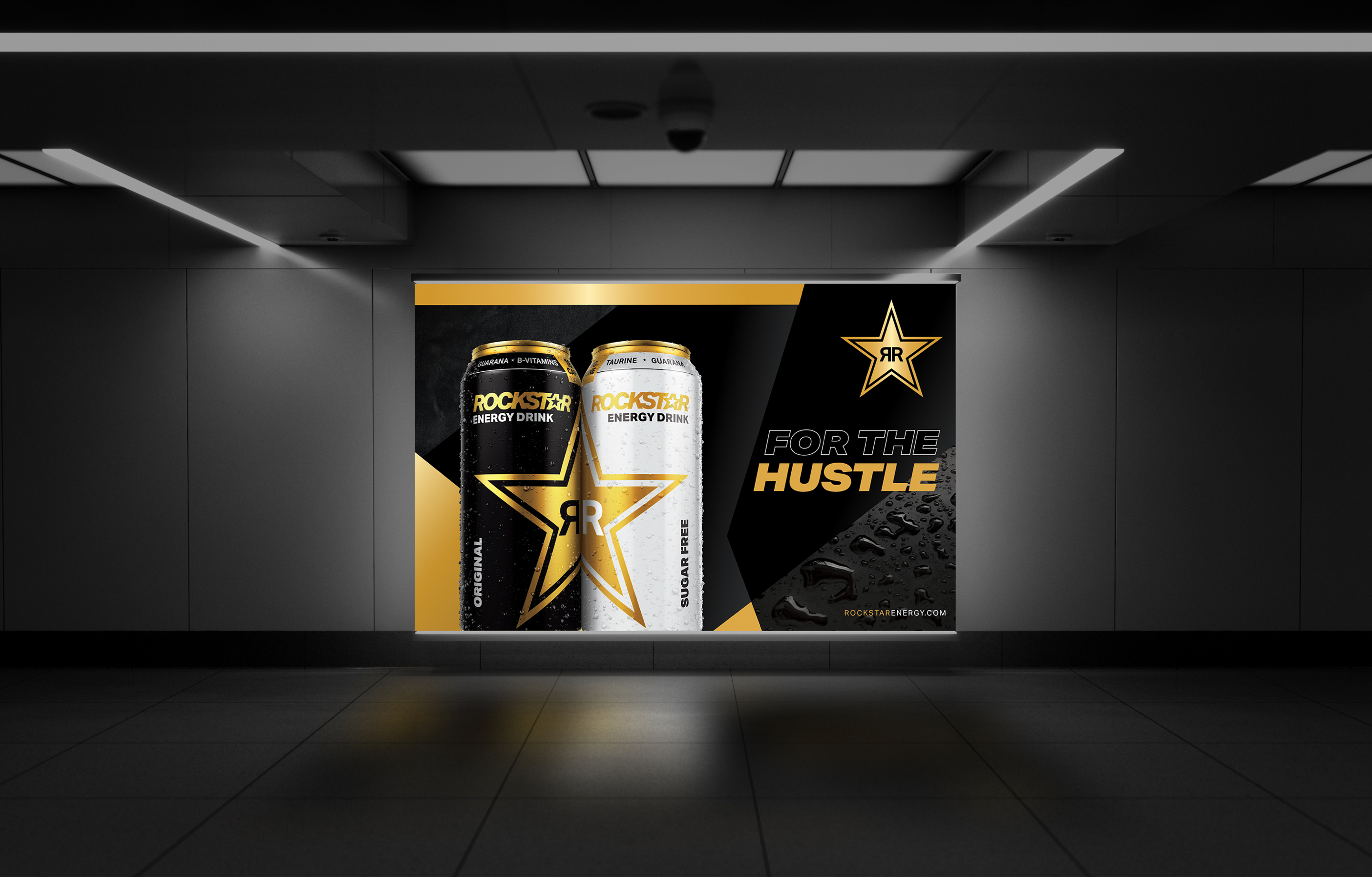
To refresh Rockstar's visual identity, we created a multi-can supergraphic that celebrates the brand's iconic star logo. By infusing the brand's visual identity with larger-than-life glamour, we transcended touchpoints the way only a Rockstar can.