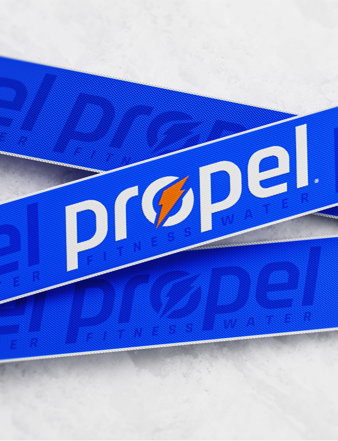
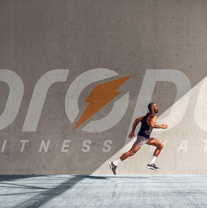
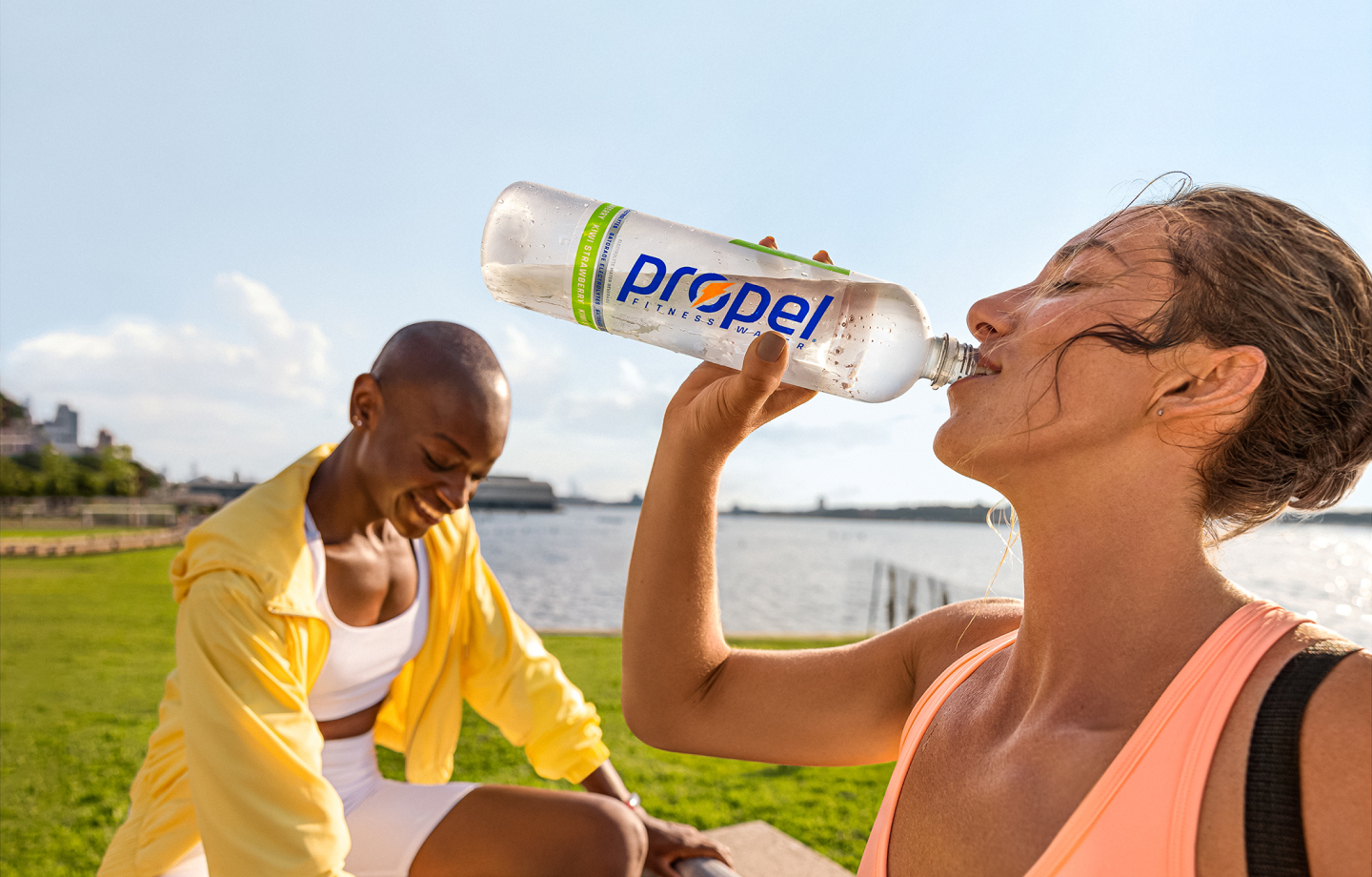
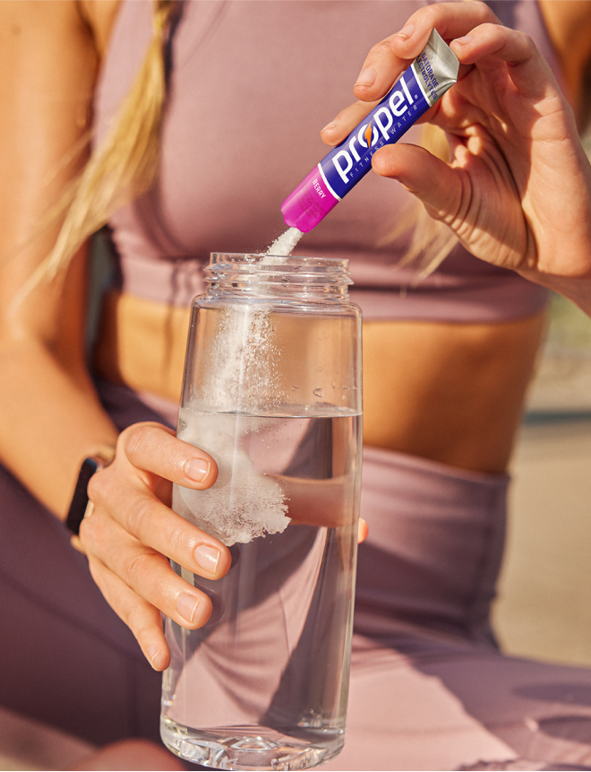
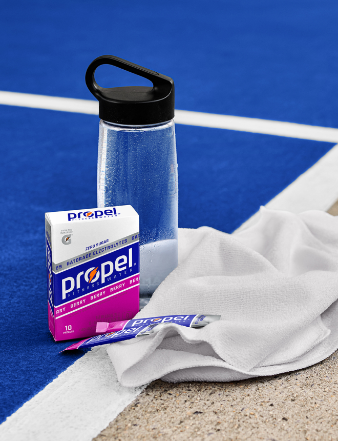
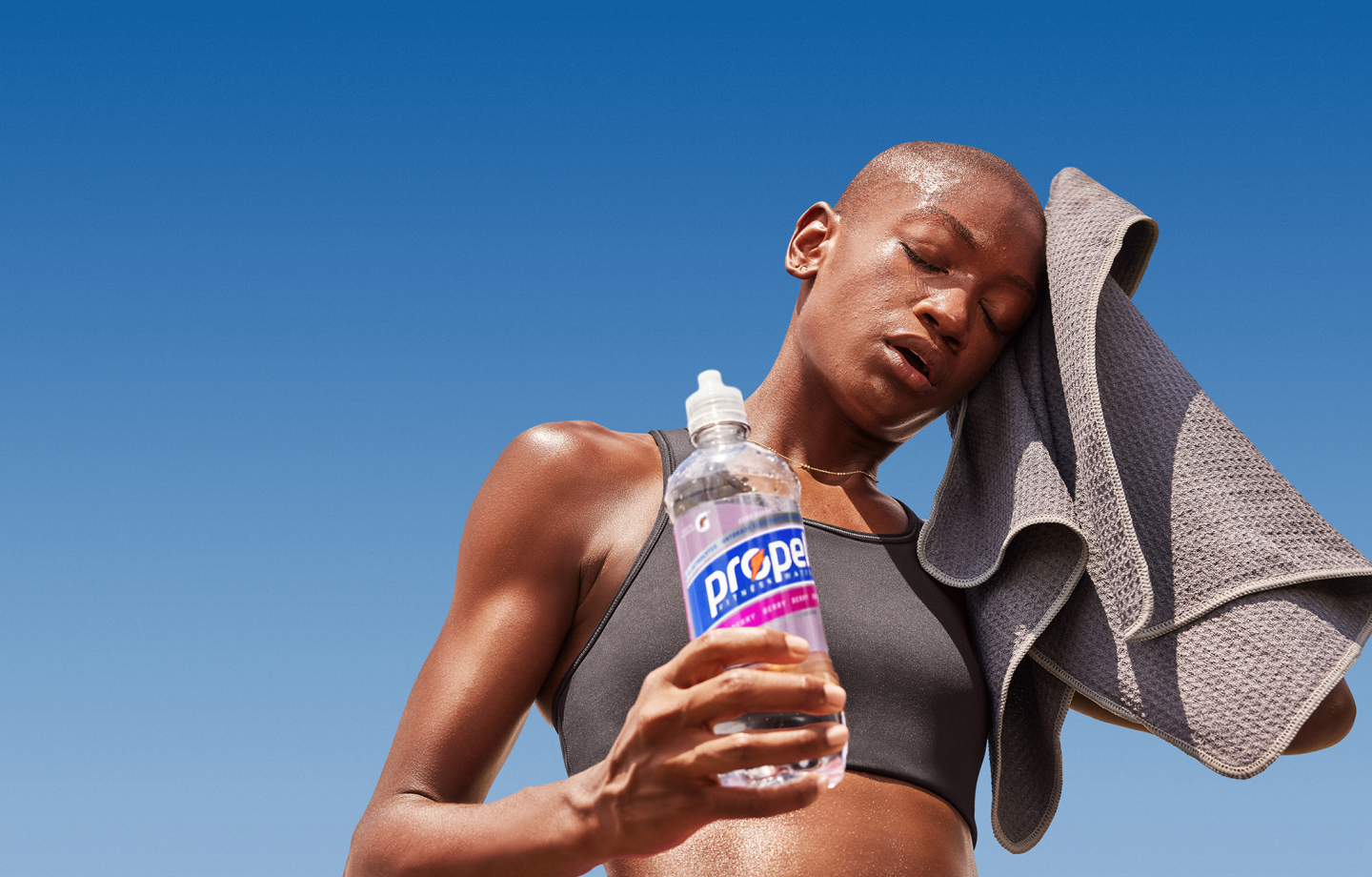
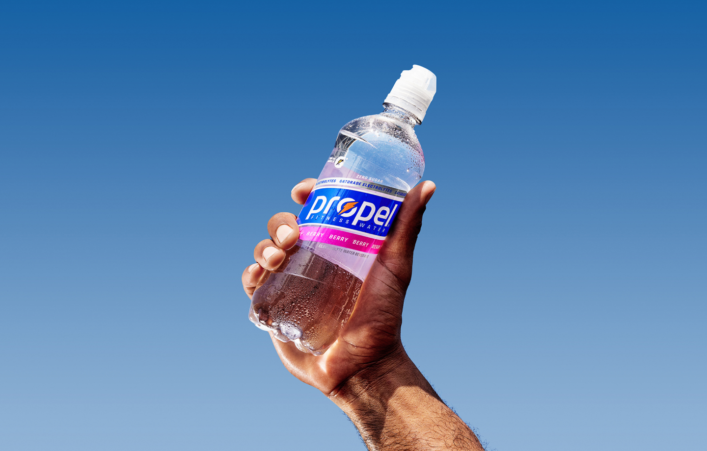
We began shifting our strategy to connect Propel and Gatorade visually. By embedding the orange bolt Gatorade is known for with our new Propel wordmark, we anchored the brand’s purpose of providing functionality for exercisers in their moments of sweat.
Propel Redesign
Fueling the future
With the science of Gatorade at its core, Propel is a zero sugar national fitness water brand that effectively replenishes you with Gatorade Electrolytes. To solidify Propel as a leader in the hydration category, we worked with Vault49 to create a bold and ambitious new visual identity system.
The Idea
Putting fitness first
Developed in consultation with the Gatorade Sports Science Institute in 2000, Propel has been on a journey to empower exercisers for more than two decades. Realizing that the Propel “superpower” is its connection to Gatorade, we began exploring how Propel could highlight the efficacy of our science-backed electrolyte water while tapping into the strength and fun of movement.
The Design
Made to move
The idea of driving forward and unlocking your potential is embedded in the very name of the Propel brand. As we strove to reposition Propel as a fitness lifestyle brand with hydration at its core, we explored the many paths that could lead to Propel standing out across physical and digital touchpoints.
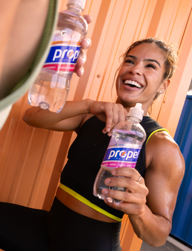
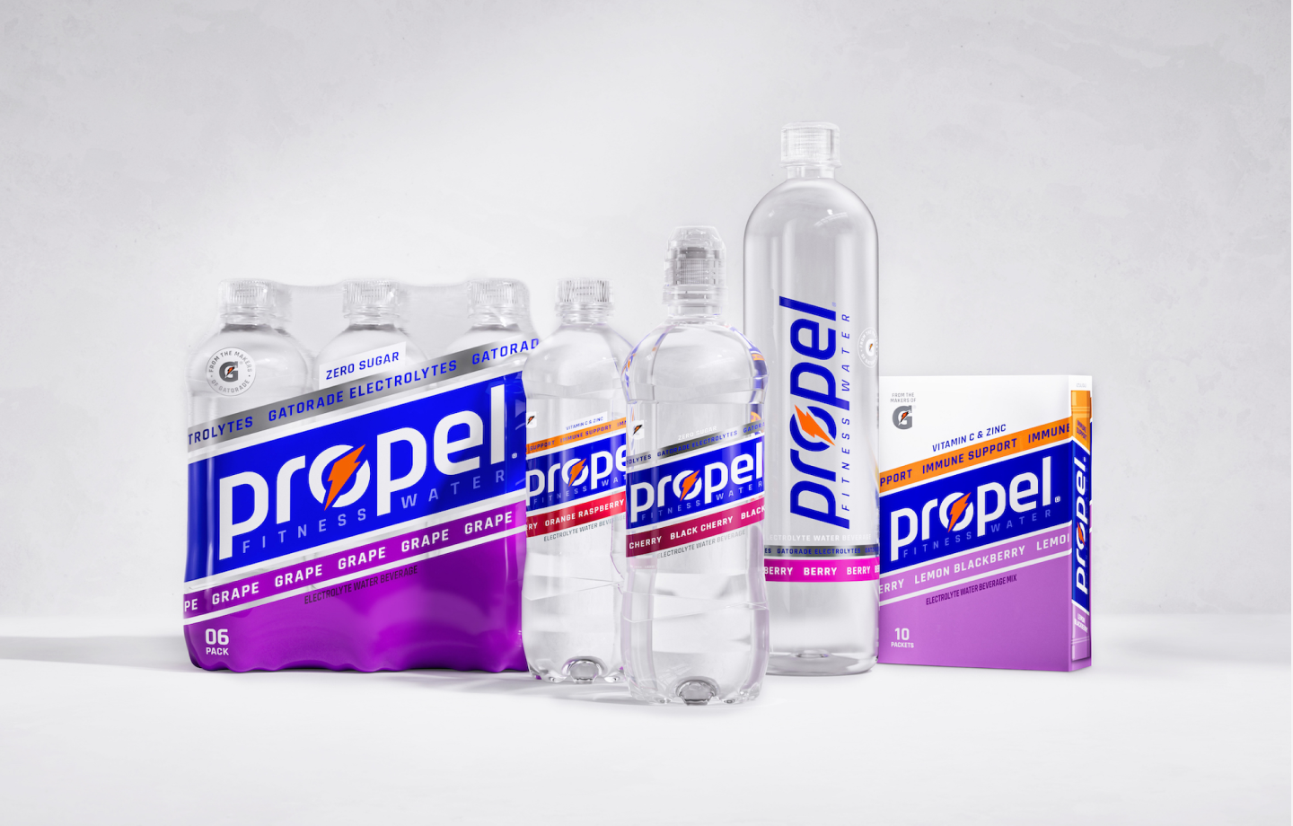
Our dynamic new visual identity system spans photography strategy and lifestyle imagery to include a fresh logo, typography, and color palette. With touches of silver and energizing neon, our fresh new look fuels the brand’s future.
The Outcome
A winning formula
The fresh look and feel of Propel debuted in 2023. Sean Huls, the Senior Design Director of our Gatorade and Energy brands, calls it an “effective visual identity that marks a new chapter in the Propel story.”