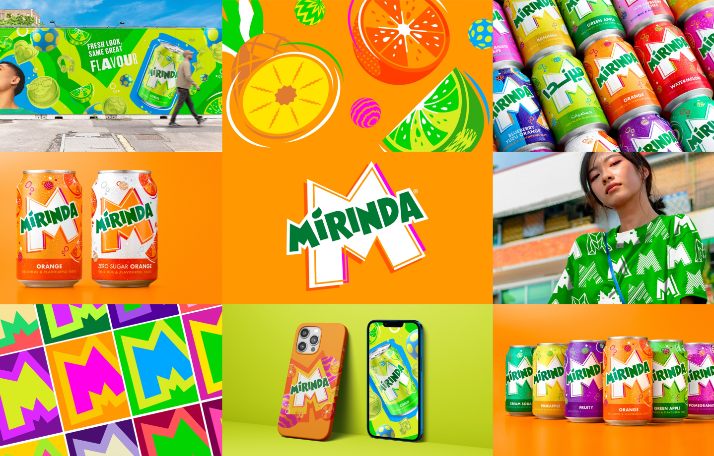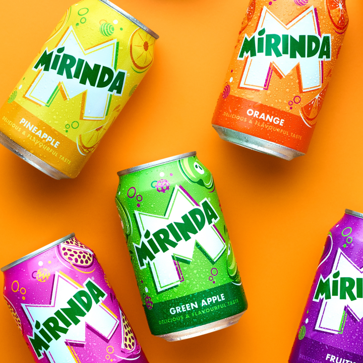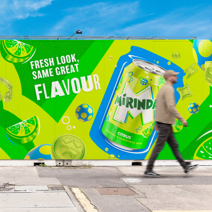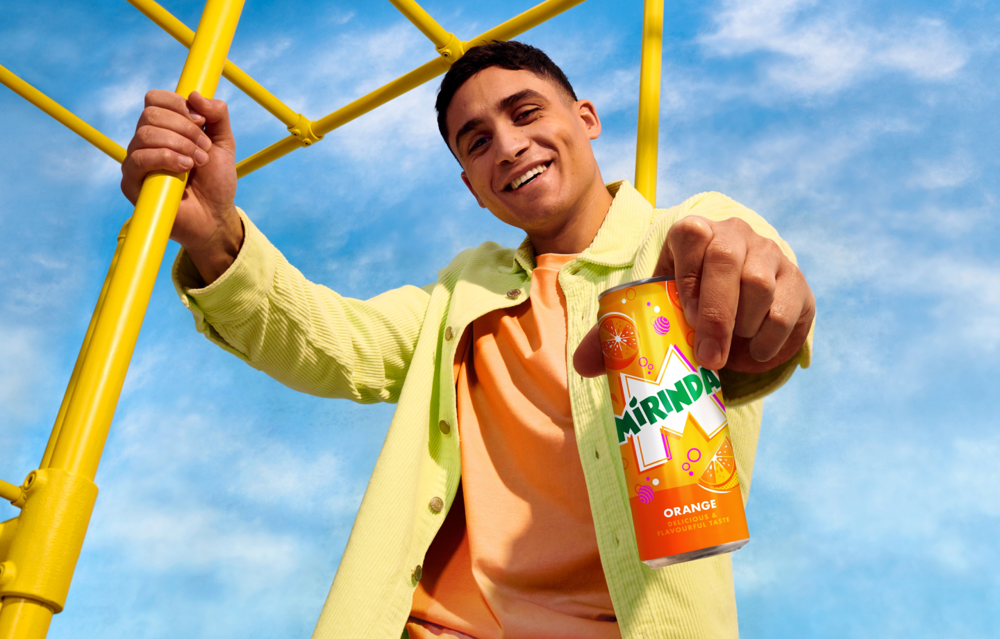
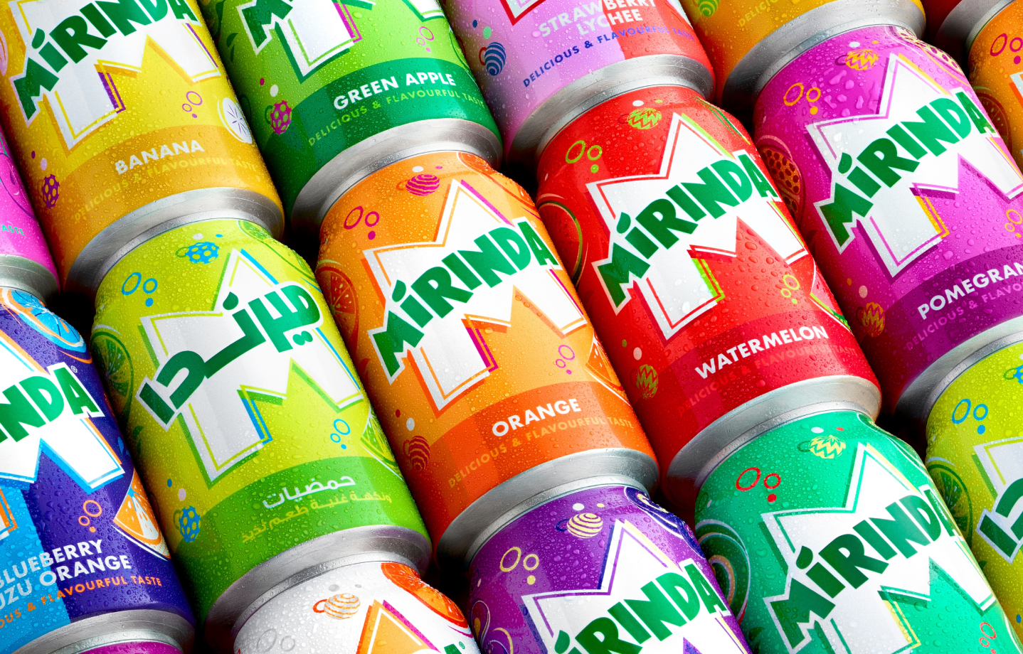
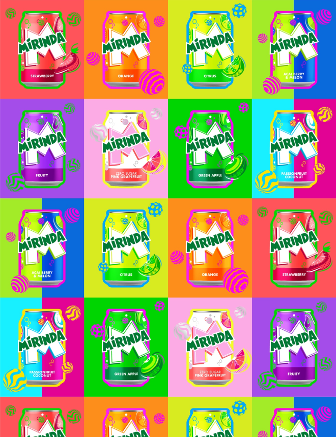
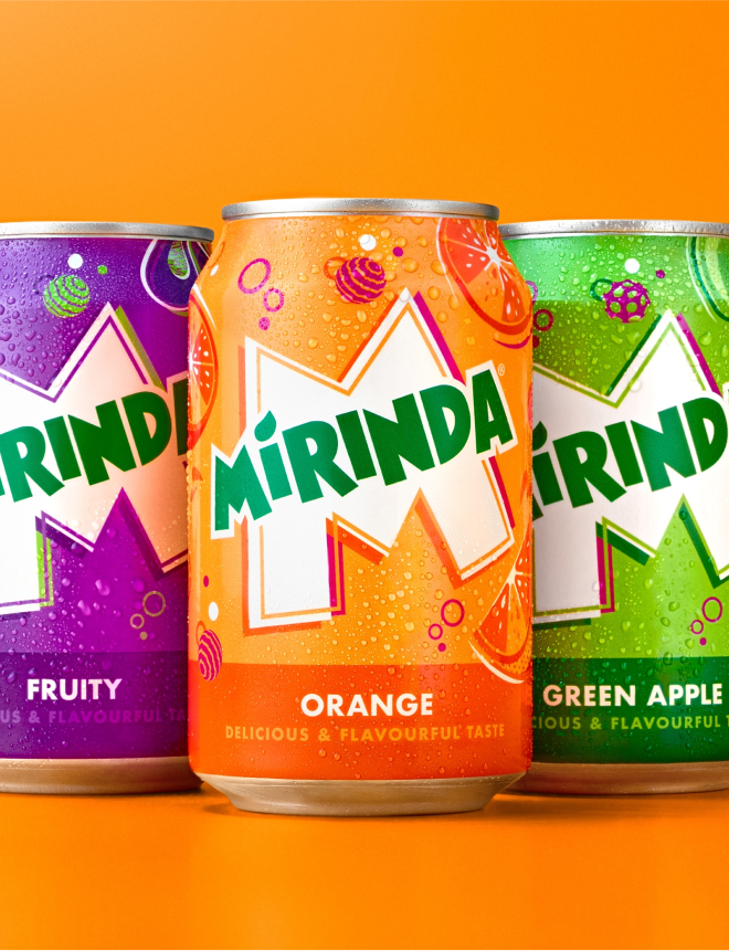
We knew a redesign of this magnitude would require uniting the brand’s flavors through a flexible system adaptable across the 200+ markets where people know and love it. With a global brand of this scale, it wasn’t enough to give our fruit-flavored soda a fresh new look. We had to make an M-pact.
A global redesign that’s all about creativity
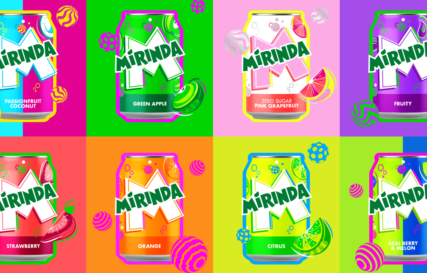
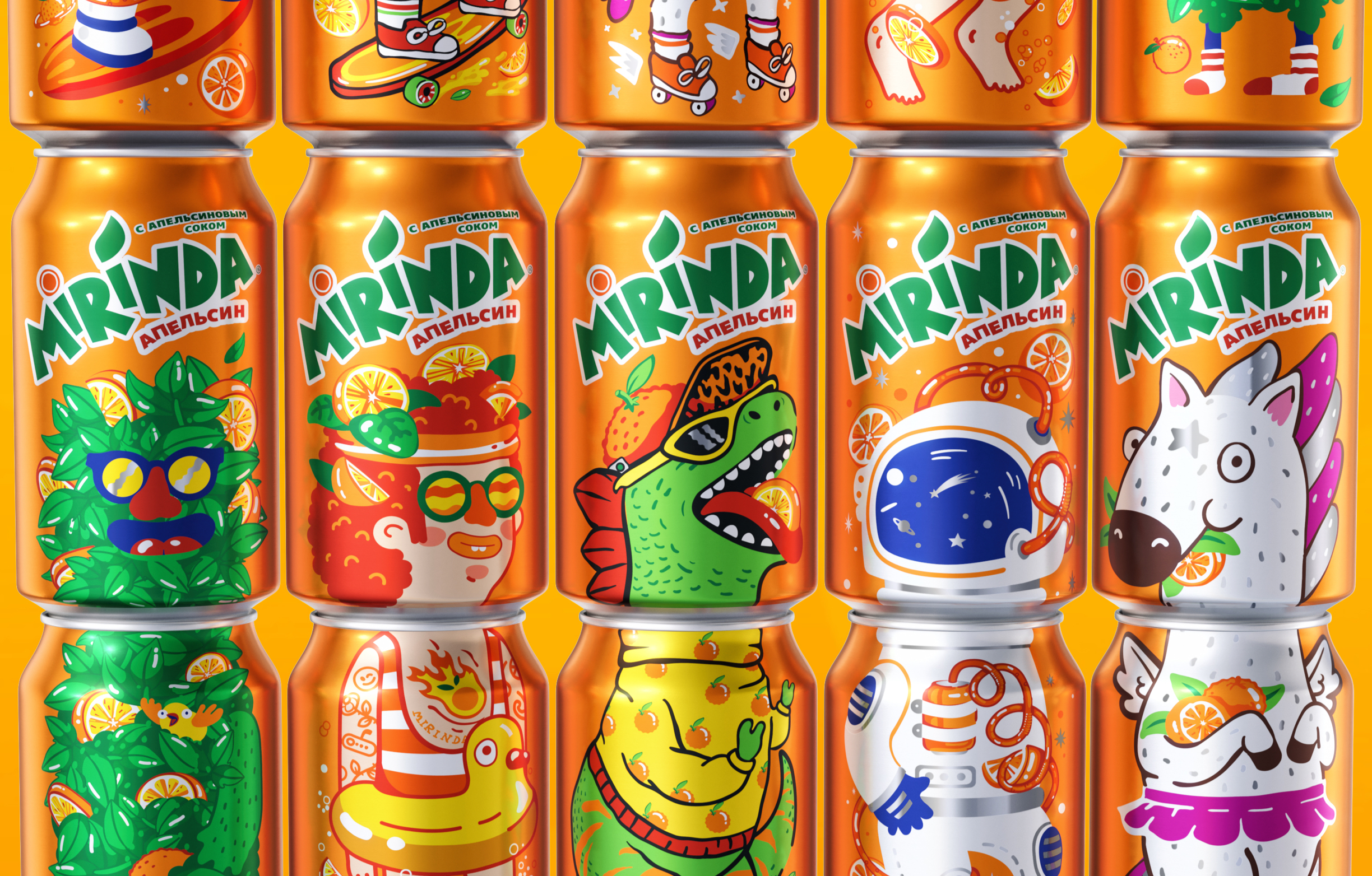
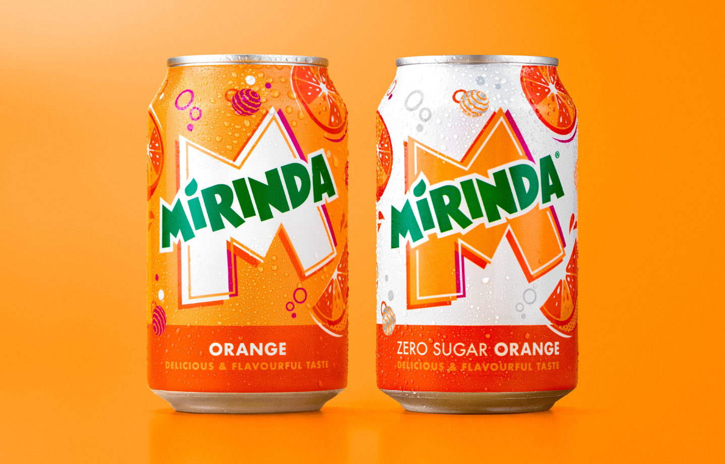
The playful new visual identity we created for Mirinda, our fruit-flavored soda, puts boldness at the forefront to celebrate those who aren’t afraid to stand out. Our global Mirinda redesign features flexible, M-pactful design that honors creativity while celebrating what makes you, YOU.